Hi All!
Welcome to my new Blog, Color+Yarn. I want to talk about the color wheel and yarn. Honestly, I am very excited to talk about this with you all, and to have someone be excited to listen since I think my husband, the IT intern, is tired of my color wheel-yarn talk.
I won’t give you a long intro– I am saving the stories of my great-great- great grandma crossing the Bering Strait to come to the Americas for a different blog on this page–so let’s get to it!
So, Color, eh?
Fart, why is it so hard to get the right combinations sometimes? You are working on your Crochet project, absolutely happy to get it going, and then, you finish it just to hate it because the final product looks like something that got well mixed in your stomach and barfed up later on.
Well, all I can tell you is that, “IT’S OK AND NORMAL.” Like with everything we do that requires a learning curve, successfully mixing colors comes with experience and observation. I can’t give you any magic wand that will solve all your color choice problems. So why are you reading this then, you ask? Well, because I am cool and you want to learn a thing or two from me. 😁 Joking aside, I have a background in design and I’ve learned about color. (I also have a law degree, but I can’t tell you how to get out of trouble because, believe me, I am a better designer than a lawyer).

It won’t look like you barfed it.”
Color Theory, the Color Wheel, and Yarn
To make the perfect color-yarn combo, we will be starting with Color Theory to learn how the colors interact with each other, their perception (which can vary, if you have a condition like color blindness or synesthesia), and how to use them so they don’t look like a pile of poop.
Using the right combinations can be a very powerful thing, since they can produce a sense of excitement in people. Believe it or not, there is a lot of psychology and emotion behind color. And that is why you feel so bummed when the color is just not right.
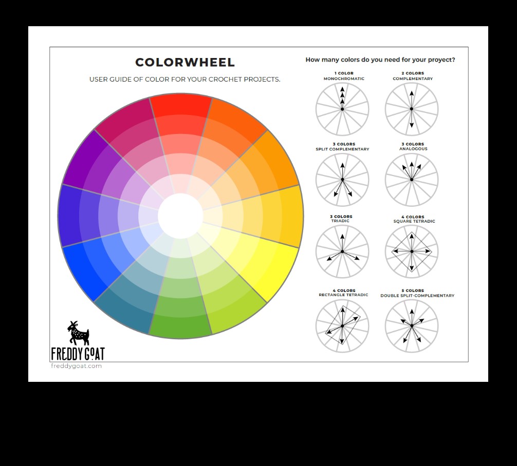
We will start with the fundamentals of colors. Download this free color wheel PDF, which you will find useful down the road. Colorwheel+Yarn_User_Guide
Color Wheel
I’ll call it, the Keymaster and Gate Keeper.
It holds the secrets of color.
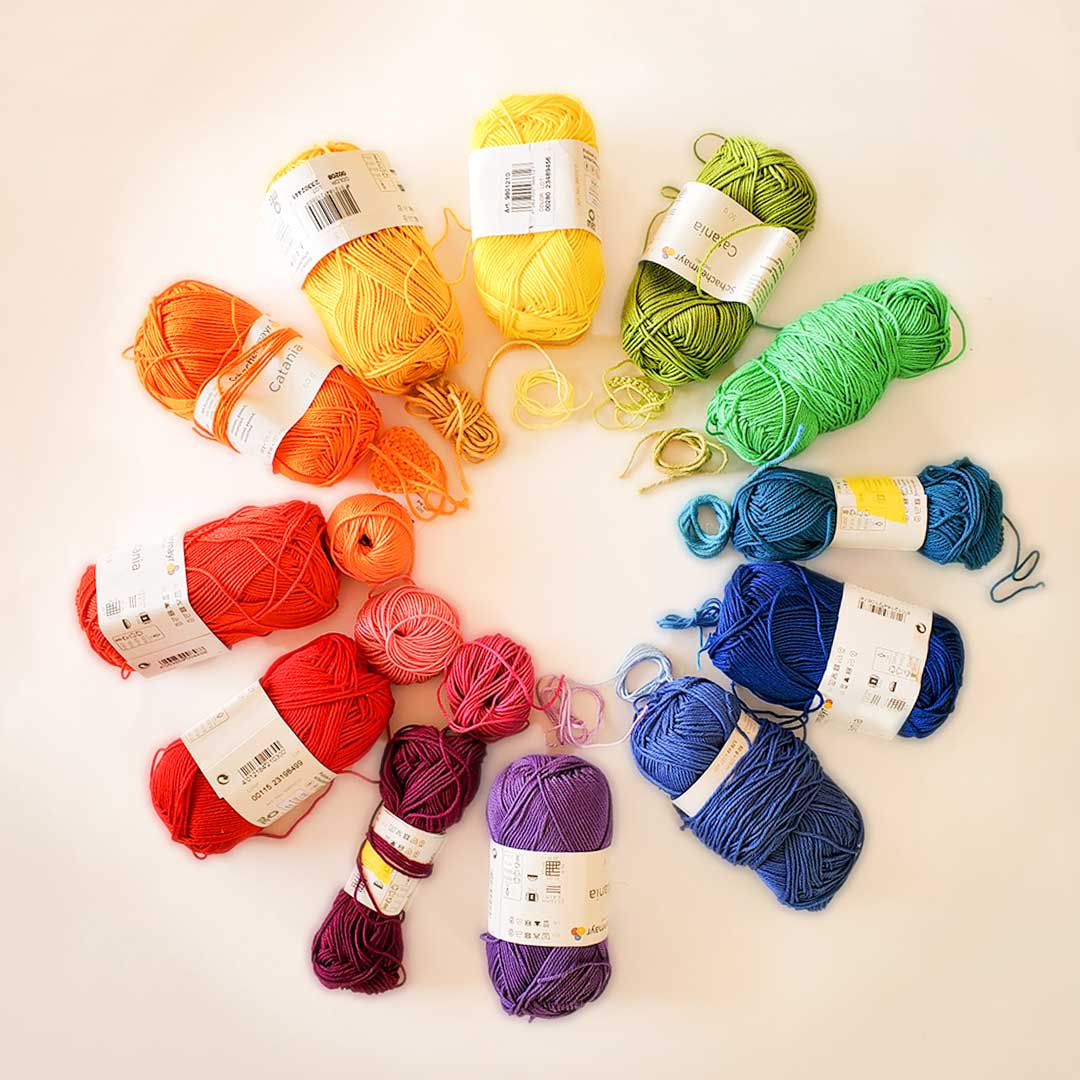
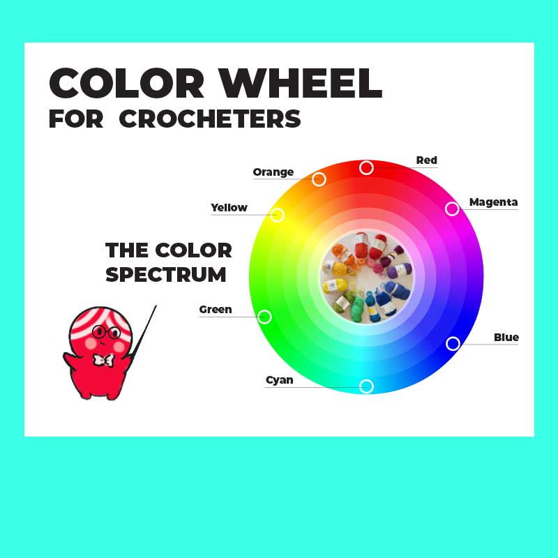
This beautiful circle will show you the different colors that are often perceived. For our purpose, we will divide this into primary, secondary, and tertiary colors. Imagine this wheel is the cast of a k-drama and you are watching the color relationships and romance unfold. Which ones are compatible? Which ones will have a fist fight? Everything is written there, but in a circular, magical, and dramatic way. if you need to get an idea of the color spectrum download this free PDF! colorwheel_yarn_spectrum
Primary Colors
Let’s call them, our main characters.
Everything develops from the primary colors. These three colors cannot be created by mixing other colors together. Aww! A love triangle, making this drama more interesting!
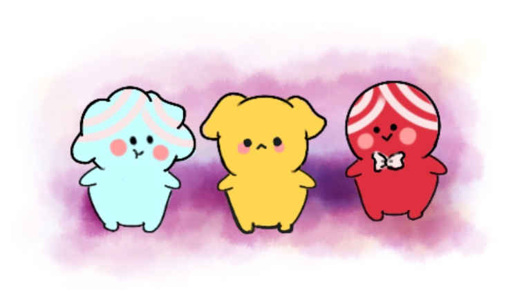
Our main characters are: Red, blue, and yellow. They are the foundation for creating all other colors. You know, red loves blue, but yellow is also very interesting; from there, imagine a whole universe of fan-fiction where the main characters mix all the way and have a bunch of beautiful children together.
Secondary Colors
The amazing supporting characters of our drama.
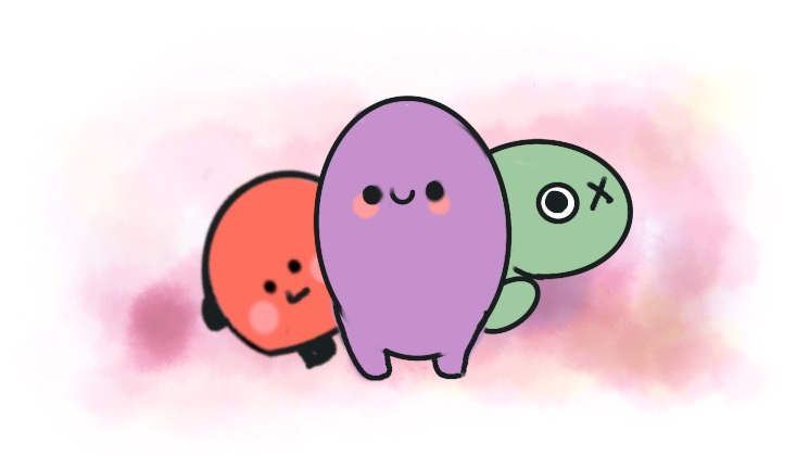
Without the secondaries, this whole show would be canceled within the first season. These colors are created by mixing two primary colors together. The secondary colors are orange (red + yellow), green (blue + yellow), and purple (red + blue).
Tertiary Colors
The twist!
We were not expecting the half-brother with a totally different personality was going to show up and change the whole vibe! These colors are created by mixing a primary color with a secondary color. For example, (red+orange) creates a red-orange color. (Note, while I was writing this, Freddy popped her head in and adjusted her glasses and said, “well, actually, we call that one vermillion”. Now you know why she and I compliment so well. I love that she is a color snob.)
Color Harmonies
The development!
The romance you want to develop (I am a romantic, but this is your story, so your harmony can be a horror movie with a result of the perfect demonic possession).
Basically the main goal of this whole blog is to get the most balanced and beautiful combinations, the ones that will cause a positive emotional reactions in the brain.
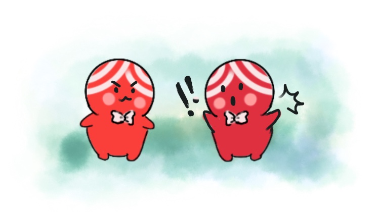
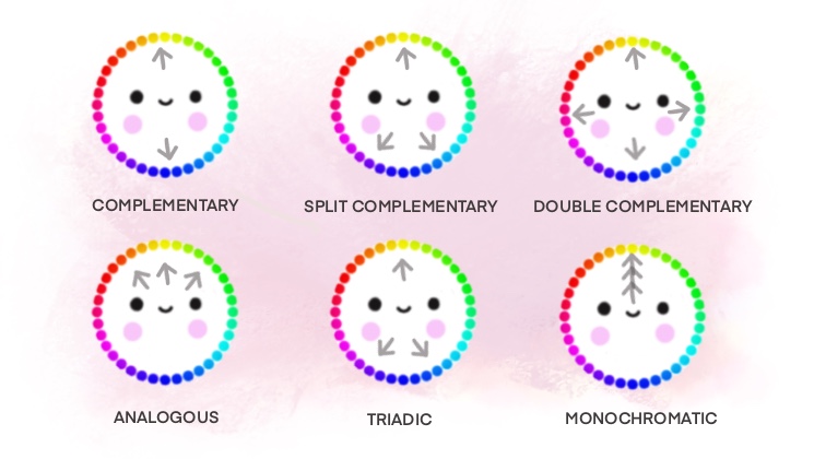
Common color harmonies include complementary colors, which is our next blog, and they are basically colors opposite to each other on the color wheel, analogous colors (we will also talk more about them later, but in simple words, they are colors adjacent to each other on the color wheel), neighbors, triadic colors (three colors evenly spaced on the color wheel), and so on. Because we will talk more about each harmony in future blog posts, I’m just giving you a quick idea now. This topic is pretty vast.
Color Temperature
Setting the mood hot or cold
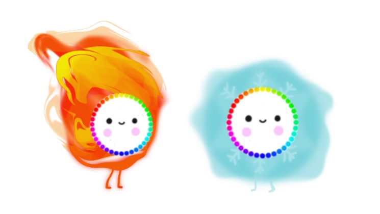
Like the great Katy Perry said once “cause you are hot and you’re cold, you are yes and you are no…” so that is basically what we mean with color temperature, the mood you want to give to each piece you design. We often perceive colors as warm or cool based on their position on the color wheel.
*Quick thing: Warm colors like red, orange, and yellow, are pure passion and fire.
Cool colors like blue, green, and purple, are calming and soothing, the moment of reflection you need after an intense moment.
Contrast
The casting.
This describes how you put different colors together to create a good story, like mixing different personalities together to create interest. It goes from low contrast to high.
High contrast is when you place very different colors together.
Low contrast is similar colors or shades for a more exquisite palette.
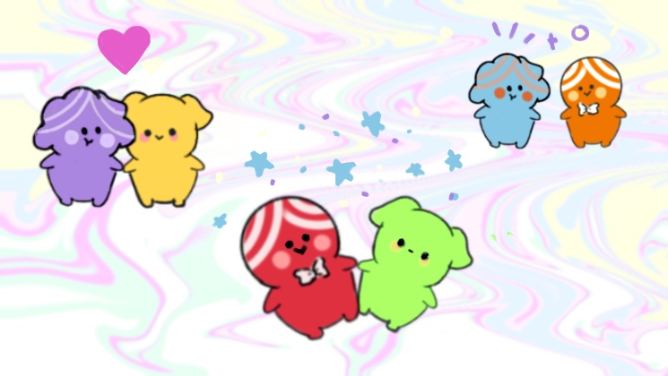
These are all examples of high contrast color pairings.
Color Psychology
Finally, I just want to mention color psychology. Why? Because it is fun to find out that colors can produce certain emotions and have psychological impacts on people.
You know, red often represents passion or danger, blue embodies calmness or trust, and yellow glows with happiness or optimism. Never forget that cultural and personal experiences can also influence these associations. You don’t want to send the wrong colored sweater to your friend in another part of the world that may think you hate her for choosing a color that for her means bad luck.
That’s all for today in my color wheel – yarn Ted talk. I hope this was a good start. Please leave a comment below if you have something extra on the topic. I am excited to have this to share with you all! So Let’s talk about the color wheel and yarn!
Have a colorful day, everyone!
I wanted to mention color psychology since I love a good explanation of why my brain reacts to certain things— like rainbow palettes for sure bring my inner 80’s | 90’s kid out of my soul, thinking of the amazing Rainbow Brite, Sailor Moon and Care Bears. Art is medicine. Give yourself some time to create something today!
Download your Color Wheels and get your yarn on!
Related Articles
Yarn Color Combinations – The Value of Color.
Hi All! Welcome back and happy New Year! Today I want to continue with our beginner’s guide on how to choose yarn color combinations. If you are wondering how to do that, this is the place for you. In each article, I try to explain a little about Color Theory so you...
Free Crochet Pattern | Wax Lips
Free Crochet Wax Lips Pattern and #Hooktober |The black magic of being overly ambitious | Part-2 | Remember our challenge to rain creativity down on you this month?!? That’s right, we created our own, overly ambitious instagram challenge for the month of #HOOKTOBER:...
Free Halloween(ie) Crochet Pattern
Halloween(ie) and #Hooktober | The black magic of being overly ambitious We LOVE fall. As soon as spring comes around, we start counting down the days, and as soon as it gets here we feel the need to feast on all those things we’ve been missing for seasons. Maybe that...

This seems useful! 😀