Hi All!
Welcome back and happy New Year! Today I want to continue with our beginner’s guide on how to choose yarn color combinations. If you are wondering how to do that, this is the place for you. In each article, I try to explain a little about Color Theory so you can apply it to your next project!
Before we get started, in case you were looking for how to make a color change while crocheting, check out this article instead: Week 2: Useful Crochet Techniques. You may find this useful if you have already chosen your colors and want to know the next step.
In my last post I told you that the next article would be about Color Harmonies. I lied! Surprise, surprise! Before I go there, I would like to talk about color values, a concept I learned from Betty Edwards A Course in Mastering the Art of Mixing Colors.
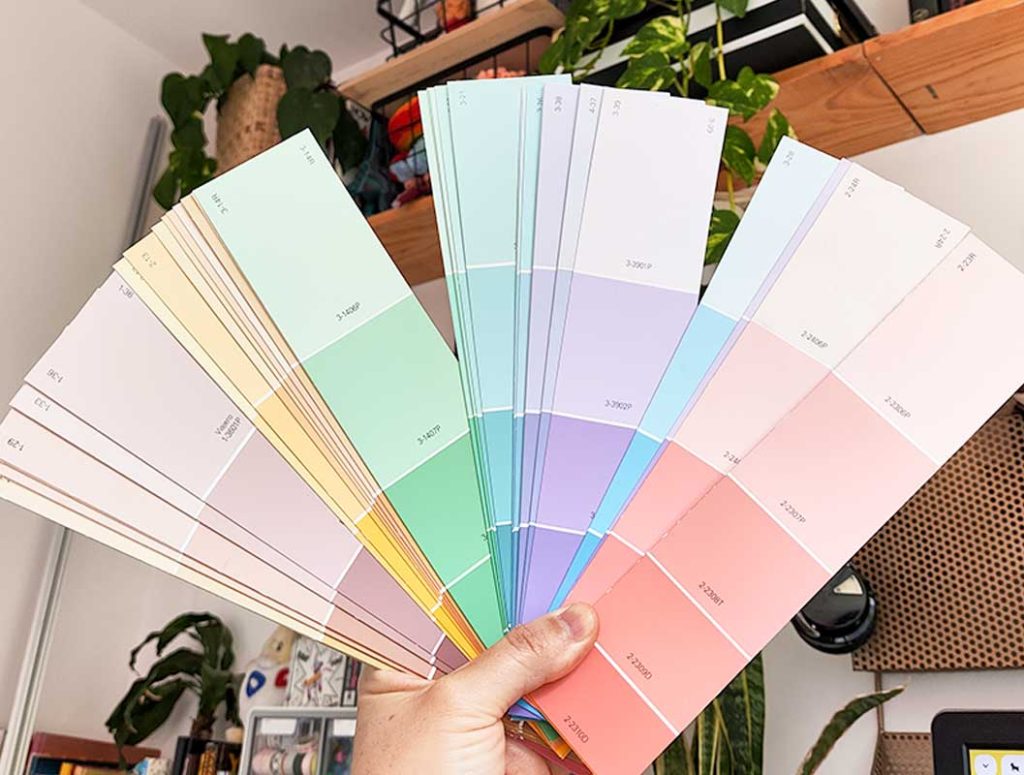
The value of a color is essentially how light or dark it is. Think of a paint strip at the hardware store, where each square is slightly darker than the previous one but the hue remains the same.
At the beginning of her book, Edwards talks about “the difficulty of seeing colors in terms of values… The value levels of color are important because dark and light contrasts are fundamental for a good composition…” So remember that and repeat it three times:
“Dark and light contrasts are fundamental for a good composition.”
“Dark and light contrasts are fundamental for a good composition.”
“Dark and light contrasts are fundamental for a good composition.”
Ok, Goat, but what does that mean exactly? That is too much Color Theory vocabulary.
In other words, a good color palette isn’t just about selecting a few hues that go well together. You also need to include a combination of color values to make things visually interesting. When you are making a blanket, top, amigurumi, or other crochet item with more than one single base color of yarn you also consider how light and dark those colors are.
Let’s start making a formula for how to choose your colors. This is just the first step in the process.
Let’s start with the Value Scale.
First, when creating your project, you must consider using a range of values from dark to light, whether that is within a single color or across multiple colors.
A color value scale is a range of a single color, from its darkest to lightest. The background image of this section is an example of a color scale of a pinkish purple hue. At the far right you see a deep violet and at the far left is a very pale pink with a purplish undertone. (Be aware these colors might look different on different screens). Essentially it is a steady gradation of one color from dark to light. A value scale is usually, created by adding varying amounts of black or white to a base color, resulting in different values (i.e. a lighter pink has more white, and darker pink has more black).
Here's a simple way to create a Color Value Scale with your yarn:
1. Choose a color for your project
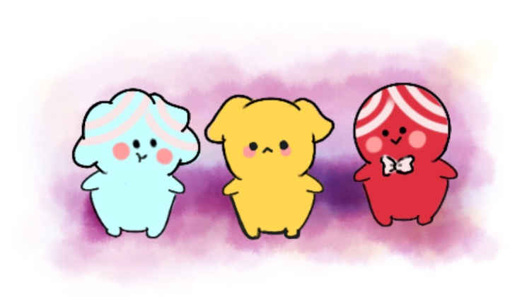
2. Determine the Lightest and Darkest Points
You need to choose how dark in the value scale are you going to choose your yarn. One end might be close to a white and the other very dark.
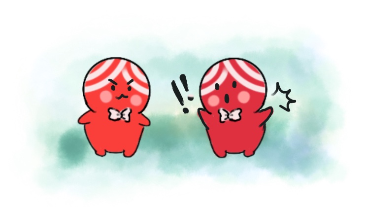
3. Create Gradations
Gradually mix in the tones of your base color to create transitions of color. Make this transition smooth from your base color to your chosen light point and your chosen dark point.
If you went through this process with several colors you can arrange these scales above and below each other to see how they work together. You might also notice that you don’t have as broad a range of values for certain base colors as others. For example, your purples might range from very light to quite dark, but your greens may all be clustered a mid-range. This is very helpful information to have in your back pocket when selecting palettes. If you want to work with a color but you don’t have a broad enough value scale you will have to figure out how to supplement your palette with light or dark values in other base colors. (Freddy complains a lot when she is designing and accidentally picked too many mid-range values. According to her, all those cute amigurumi details “get lost in the greys”).
From a practical perspective, this is something to keep in mind when yarn shopping, as different yarn brands have different arrays of color hues and values. You might even notice different availability depending on the fiber!
Helpful Tips
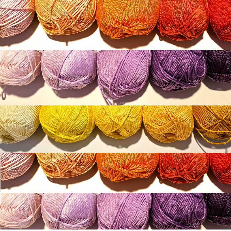
- If lost, organize your yarn in a value scale to aid you visually. Arrange the tones in a logical order, going from the darkest to the lightest. This will help you visualize the full range of values.
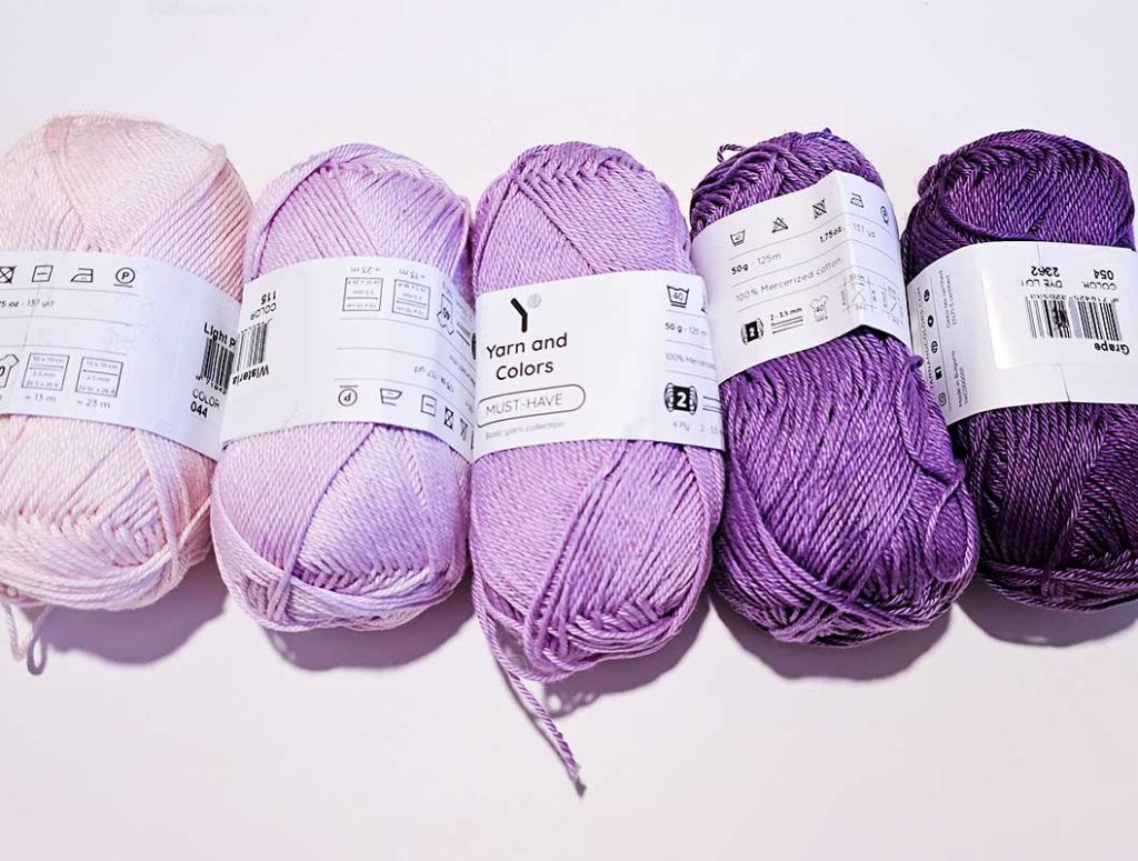
- Use Swatches. Every time I head to the hardware store to buy paint, I use the opportunity to collect color swatches. They are very helpful in checking the tonalities.
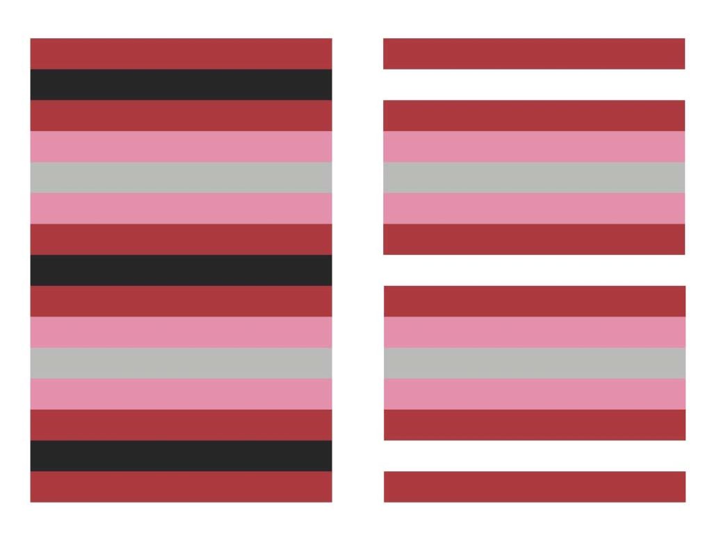
- Observe the Scale of your color, that way you will see if you like how the color is “behaving” in the light and dark compositions. This concept is covered in Josef Albers’s book Interaction of Color. For example, he explains how changing just 1 color can alter the light and weight of the original color. i.e. here you can see the red looks “tighter” when against the black.
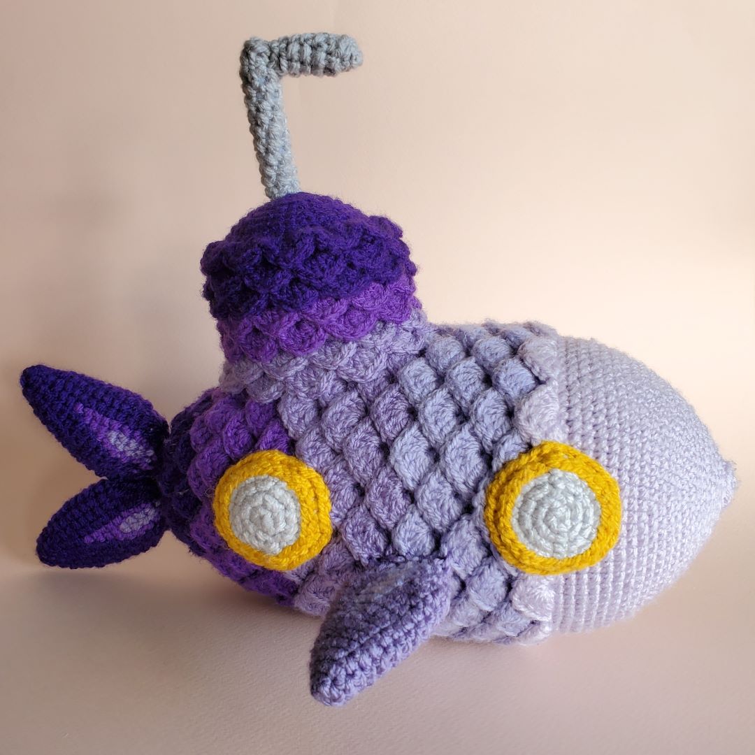
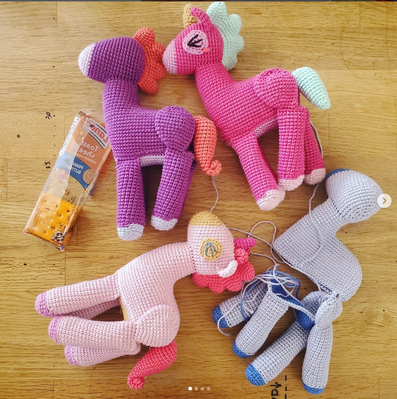
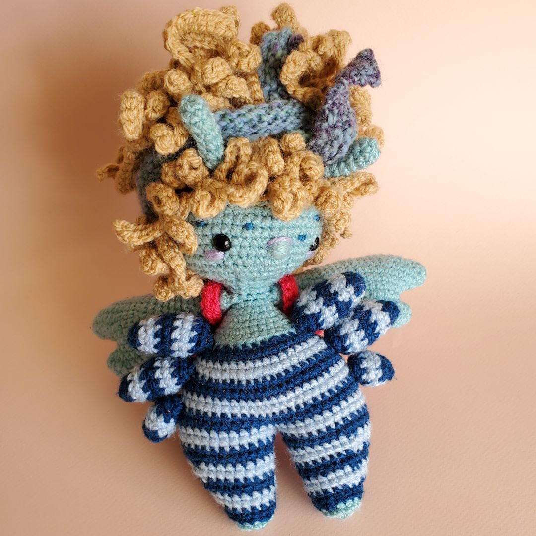
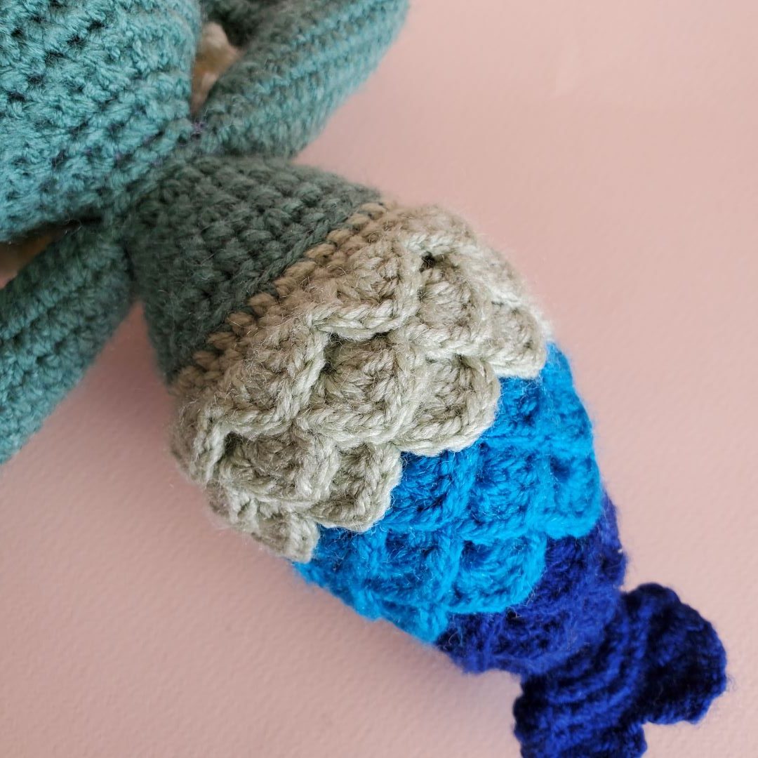
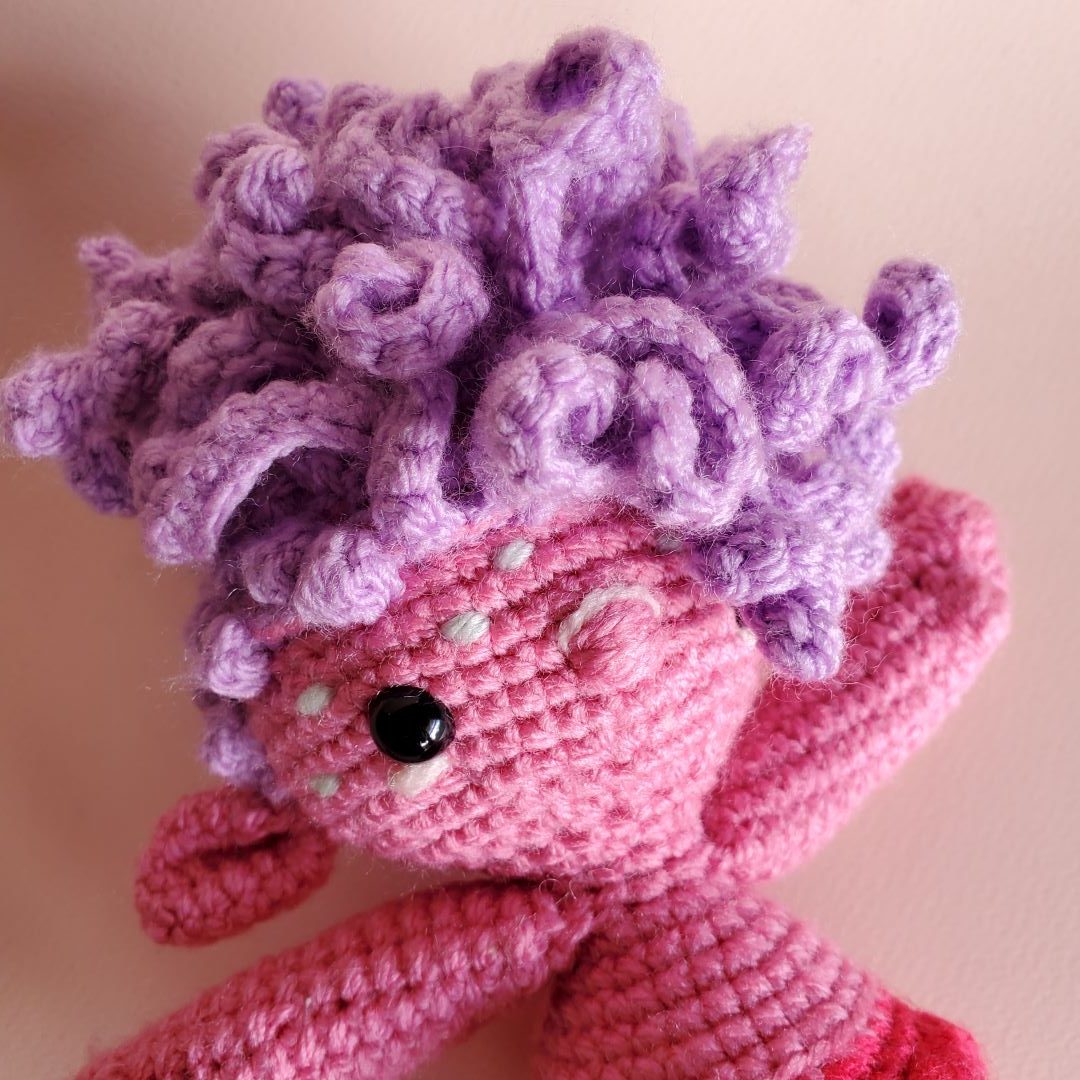
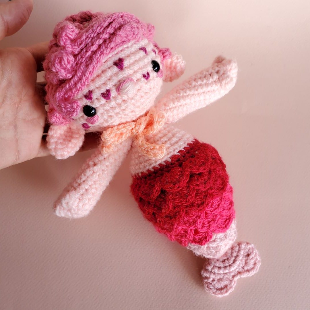
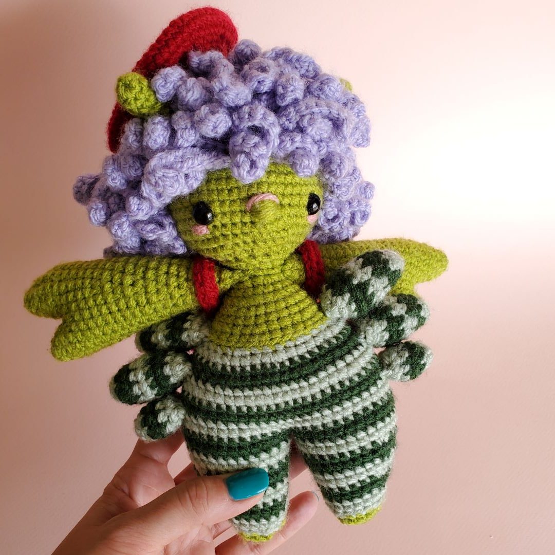
Here are some examples of how we applied color Value in some of our Amigurumis:
The Value of Color
Finally, crocheting projects having in mind the color value scale, ensures each stitch tells a story (oh, how romantic of me). I say that because you will end up with a harmonious contrast that will make your heart sing.
Well, that’s all. Don’t forget to stay tuned for Part 2, where we unravel the secrets of Color Harmonies, maybe.
Have a colorful day, everyone!
Colorful ideas move fast, so keep track of them. Believe me, it will be useful down the road. Take notes, ALWAYS.
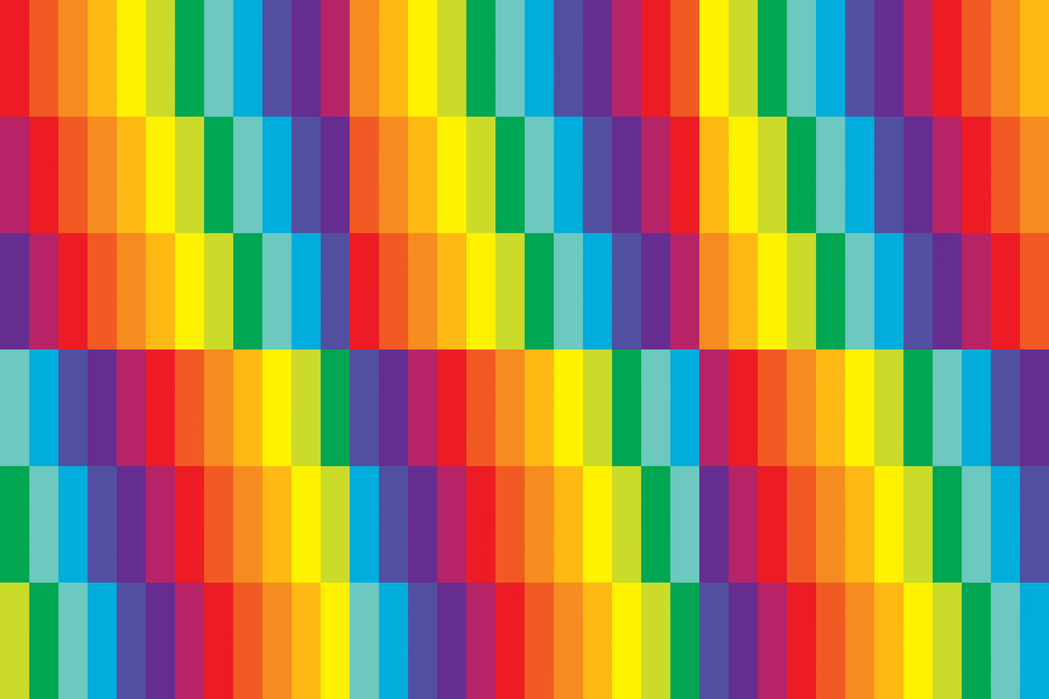
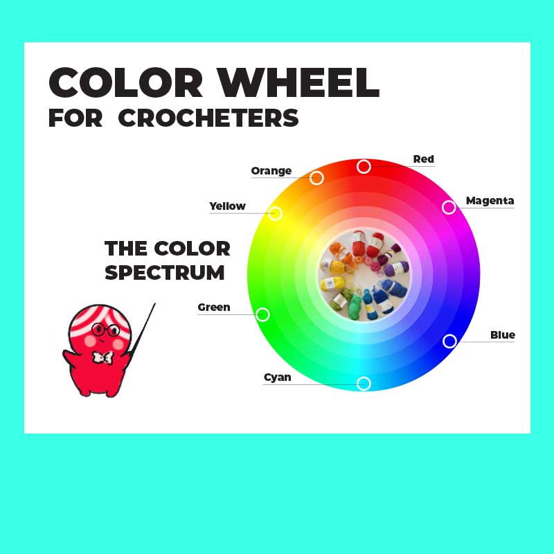
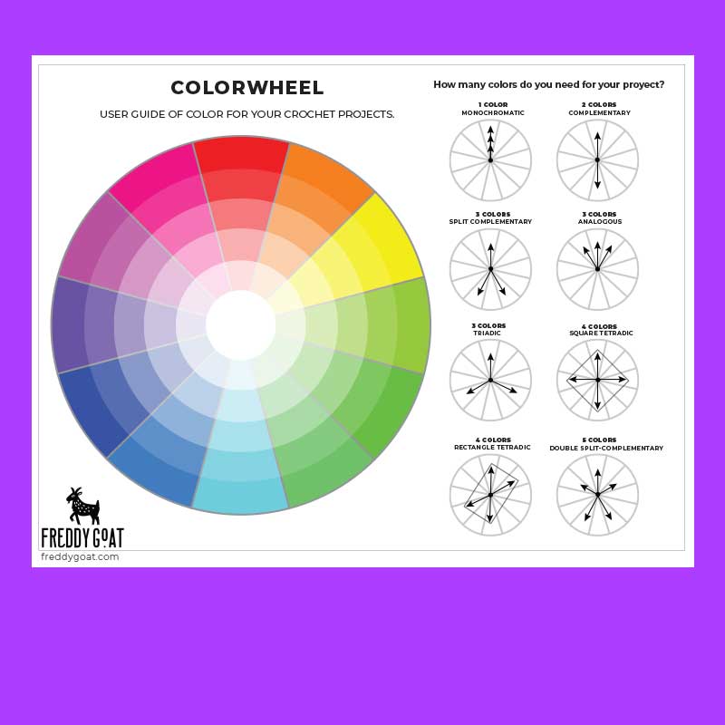
Download your Color Wheels and Check your Values!
Related Articles
Freddy’s Picks: My Favorite Tools & Yarn for Crochet Magic
Howdy AMIgxs! Freddy's Picks As you know, we at Freddy Goat love pushing the boundaries of what crochet can do—whether that’s figuring out how to incorporate stitches and techniques in novel ways, rethinking construction methods, or just figuring out how to...
Guadalajara Getaway: Art, Tacos, Tequila & Crochet Chaos!
Hola, fiber fanatics! If you’ve been following my adventures, you know I finally took a much-needed vacay to Guadalajara, Mexico—and let me tell you, it was a colorful, flavorful, yarn-tangled dream. If you’ve never been, Guadalajara is a pretty fantastic place....
Crochet Elizabethan Collar Pattern
Give your amigurumi Shakespearean era RIZZZZZZZ Do your amigurumi lack a certain je ne sais quoi? Do friends and family dismiss them as “stuffies”, “cute lil guys”, or “critters”? Do you find yourself wishing your amis had... GRAVITAS?!? We at Freddy Goat understand...


Awesome post! I love how the website looks too 🙂
Thank you! I hope you found it useful