USING ROYGBIV
(& who said that’s easy to pronounce?)
Remember when we were kids and wanted everything in a rainbow color palette? Oh! Those simple days, when our queen Lisa Frank reigned over our notebooks, stickers, and pencil cases. Although I haven’t steered too far away from wanting that same color scheme all the time, now, as adults, life has gotten busier and we find ourselves sticking to “adult aesthetics” which are usually monochromatic. But how many times how you been at the grocery store jealous of the little girls wearing rainbow tights? Me? Countless times. (I am also jealous of their tutu skirts, because I need that confidence again). Since I have been craving bright color coming back to my adult world, I can only imagine you feel the same way. So let’s practice using the rainbow color palette and bring it back together.
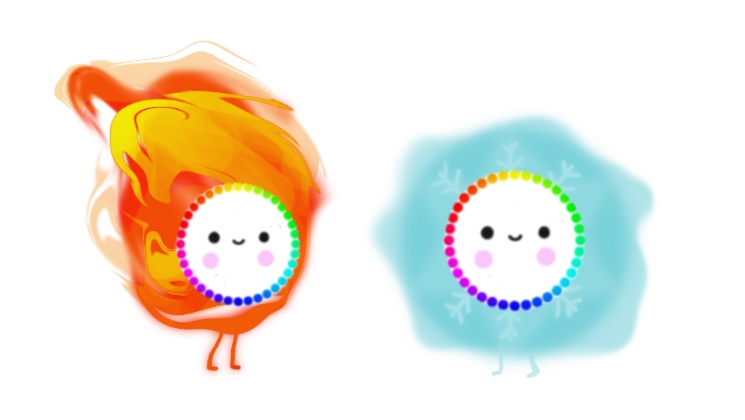
First, a bit about the rainbow. The rainbow is not magical, despite how it makes us feel and our desire to find the pot of gold at the end of it. In fact, it is an optical phenomena, and it occurs when sunlight is refracted while passing through water droplets in the air. The result? It creates a beautiful spectrum of colors. (Ok, that was all the science for today and, tbh, that still sorta sounds like magic). But, in case you’re ADHD like me and now you’re falling down this rabbit hole, check this NatGeo’s article to learn more about he science behind it. Your’re welcome.
Now, let’s go back to Pre-K, when our teachers were explaining the colors to us (you can clap your hands while we do this and sing along in your head, because why not):
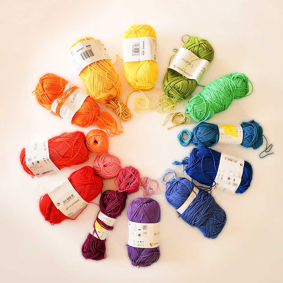
From top to bottom, the colors of a rainbow are red, orange, yellow, green, blue, indigo, and violet, and this makes the acronym ROYGBIV (easy to remember, eh?T_T). In this order, the rainbow basically goes from warm to cool colors. Just in case you don’t remember our last lesson check out the last post in this series.
But, what’s the rainbow color palette? And how do I apply it in my next project?
A rainbow color scheme is a staple of color usage. It is vibrant, energetic, positive, inclusive, diverse, magical and much more! Not only easy to understand, but also hard to get wrong. For visual arts and design, a rainbow color scheme helps to create a vibrant and colorful aesthetic. It has a connotation of youthfulness and play (think toddler toys). In cinema it has been used to symbolize hopes and dreams (The Wizard of Oz). And, most notably, it has been used by the lgbtq+ community to represent the diversity of sexual and gender identity experience and the true vibrancy of an often marginalized community. Clearly it is both visually and psychologically powerful.
The goal right now is to apply it in our craft. The mood of your final product will be bright and cheerful, sweet and dreamy, or reserved but audacious depending on the tonalities you choose: pastel and candy-like, bright and saturated, or deep and dusky.
Once you know the mood you want your finished piece to have, I will tell you now how to choose your yarn.
THE ASSIGMENT:
Rainbow color palette yarn study
STEP 1
Pick a project!
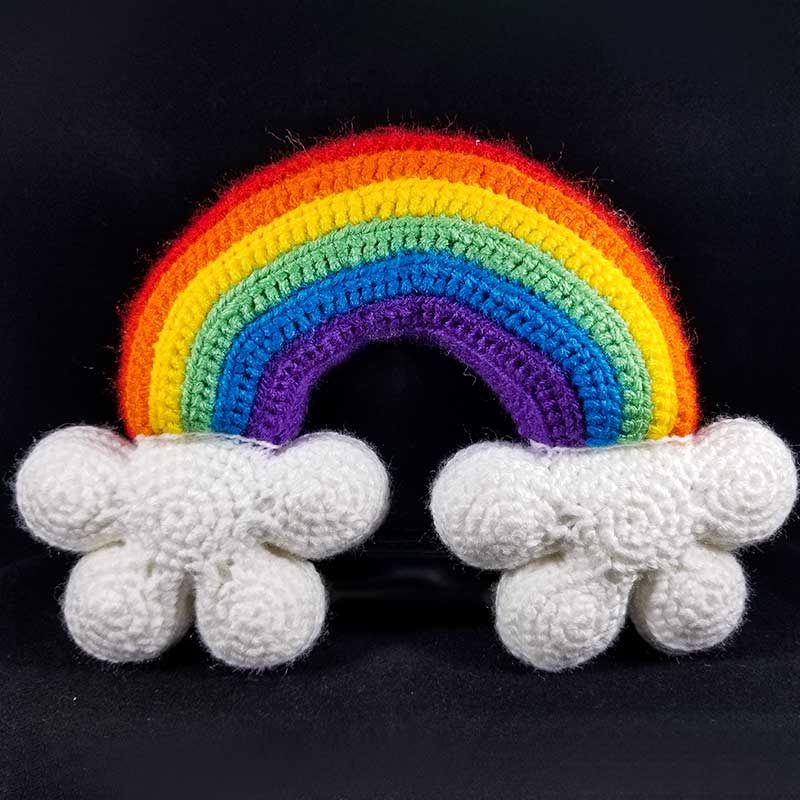
You need to choose a project that needs the whole “ROYGBIV” color palette. I am talking about using all 7 colors of the rainbow. Please consider that this requires that you know how to color change in crochet (or other yarn art). If you need some instruction on that, check out our tutorial on crochet color changes. If you just want to practice your rainbow color palette and don’t want to think too much about what to make, please feel free to make our “Free rainbow amigurumi pattern”. And, if you are thinking of making something else, well, the possibilities are infinite and the sky is the limit! Rainbow scarf, rainbow blanket, rainbow ami, rainbow top… you choose!
STEP 2
Set the mood! 😉
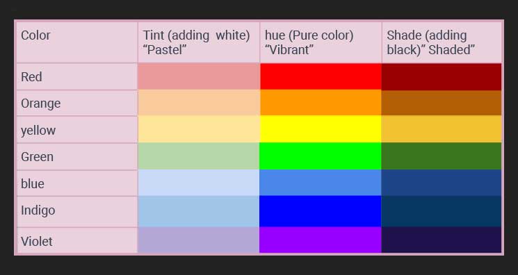
Now, the mood! In the board I made (below) you’ll see 3 moods. We will call them Pastel Dream (Column 1- for a sweet candy-shop aesthetic), Bright and Eccentric (Column 2 – for something shiny and loud), and Dark and Reserved (Column 3 – for those who love color, but also darkness). It isn’t on this board, but I will give you bonus points for a mood I’m calling “rainbow Lisa Frank style.” Go wild and tell me how it turned out, but stick to the rainbow color palette.
STEP 3
This step is optional. Use neutral colors to add something extra.
You can use black and white yarn or a combination of both for details in this project. Additionally, you may combine the three moods if you are experimenting hard and want to see how it looks. Warning, you may hate it or love it if your tonalities (tints, hue, and shade) clash, but the most important part of this practice is to stick to the rainbow colors in rainbow order because the rainbow palette visually explains the transition from warm to cool and vise versa. And even if you don’t love the outcome, you’ll be learning something.
Final thoughts!
This could be a great stash buster if you happen to have a lot of colors lying around. You can work your project with an equal amount of each color or choose one main color and add detail with the other ones, but stick to the rainbow color scheme. So go wild experimenting with it.
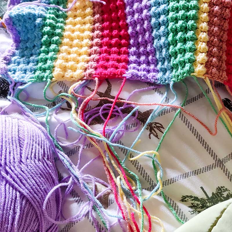
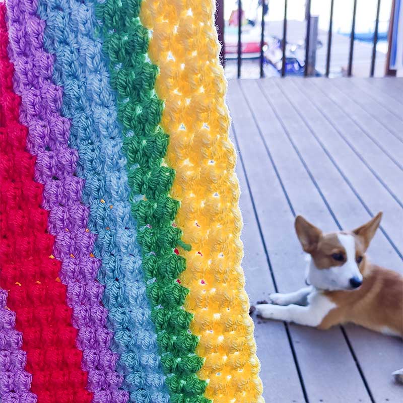
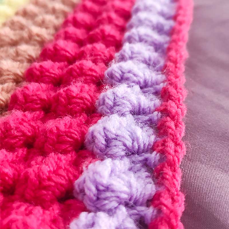
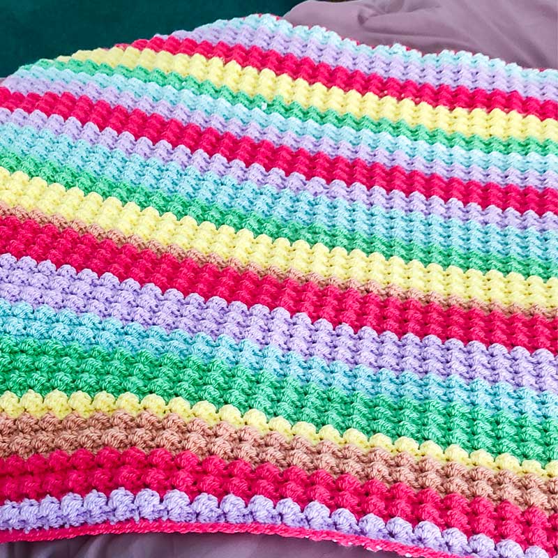
During summer break, I made this rainbow crochet blanket (designed by the amazing designer Crochet in the Sun) for my niece. I was working with a limited set of yarn colors and I don’t love the transition from the pink to the orange. The pink is bright and eye catching and the orange is flat and muted. I think my eye is catching on this because the tonalities of the two colors are very different.
Try the same experiment. Hang your piece up on the wall and take a few steps back. Is your eye catching on any color transitions that are either working well or really bug you?
Pinpointing those things will teach you why and how colors work together. Sometimes we are stuck with the yarn we have on hand, so make it no matter what yarn you have and learn from it. BTW, my niece loves her blanket and does not care one bit about the boring orange.
Post your makes and tag me on insta so I can see what you make and we can talk about what is happening with the colors!
Have a colorful day!
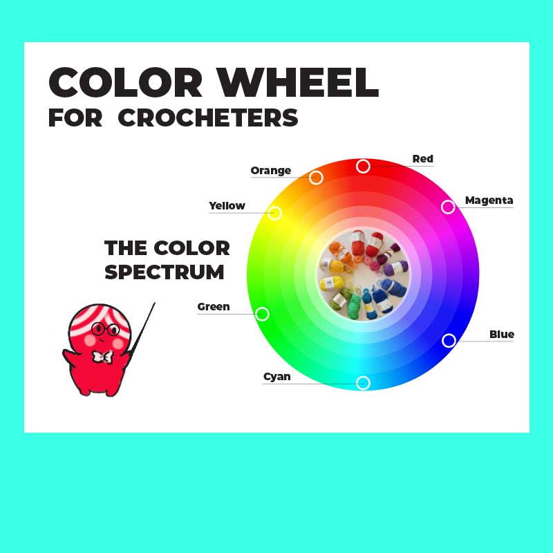
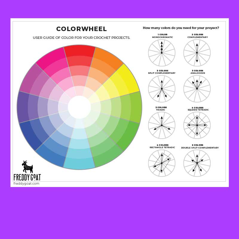
Download your Color Wheels and get your yarn on!
Related Articles
Freddy’s Picks: My Favorite Tools & Yarn for Crochet Magic
Howdy AMIgxs! Freddy's Picks As you know, we at Freddy Goat love pushing the boundaries of what crochet can do—whether that’s figuring out how to incorporate stitches and techniques in novel ways, rethinking construction methods, or just figuring out how to...
Guadalajara Getaway: Art, Tacos, Tequila & Crochet Chaos!
Hola, fiber fanatics! If you’ve been following my adventures, you know I finally took a much-needed vacay to Guadalajara, Mexico—and let me tell you, it was a colorful, flavorful, yarn-tangled dream. If you’ve never been, Guadalajara is a pretty fantastic place....
Crochet Elizabethan Collar Pattern
Give your amigurumi Shakespearean era RIZZZZZZZ Do your amigurumi lack a certain je ne sais quoi? Do friends and family dismiss them as “stuffies”, “cute lil guys”, or “critters”? Do you find yourself wishing your amis had... GRAVITAS?!? We at Freddy Goat understand...


0 Comments